New North End Community Website Project
Welcome to The New North End community website project

Project Background
This site was created with a diverse community in mind.
Users want an easy-to-navigate experience from the home page to the login page.
Users want a place to store their favorite event photos with one another.
I need to discover how to make the new features benefit the users’ experience, ensuring their journey is smooth and complete.
Issues with the current web:
No user account
No place to store photos
Issues with logging in
No notifications of the latest events
Understanding The Users

Simone is a full-time doctor at a children’s hospital.
She wants to be more involved with events and the community to become closer to her neighbors and friends.
She is looking for the New North End Website to be easier to use so that she can be better informed of recent events
User Journey
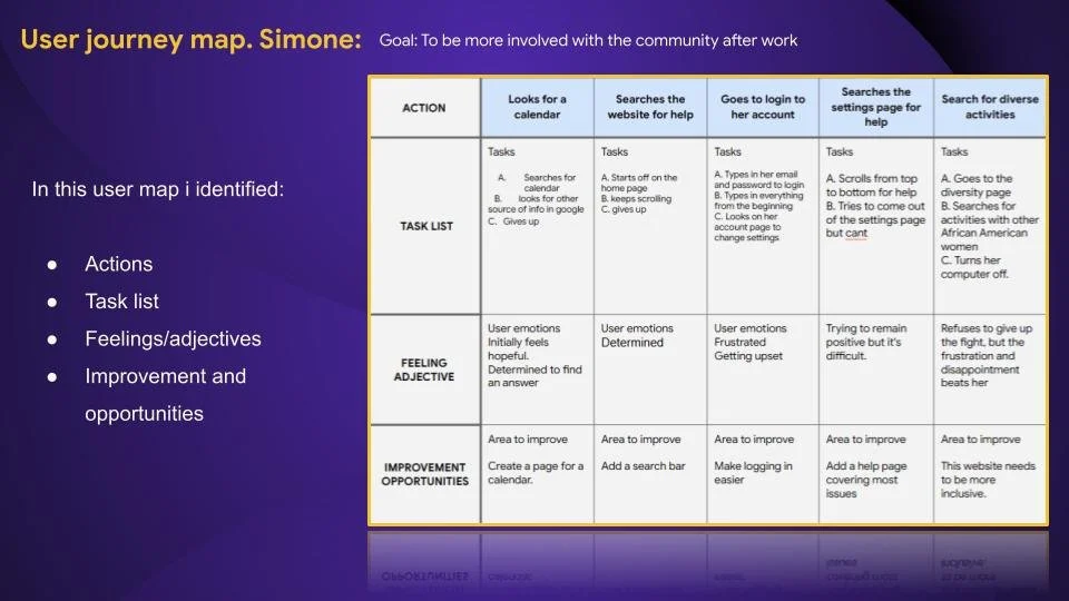
The user journey map for Simone specifies:
Actions taken on the website
Tasks list
Her feelings and frustrations
Improvements or opportunities going forward
Pain points
User found no help or difficulty with the search bar. The search bar wasn’t working
Users were experiencing difficulties going back to the homepage because there wasn’t tag in the navigation bar
Users found that the log in tab was too close to the new account tab and found they were unnecessarily typing out their email and password
Starting the Design Journey
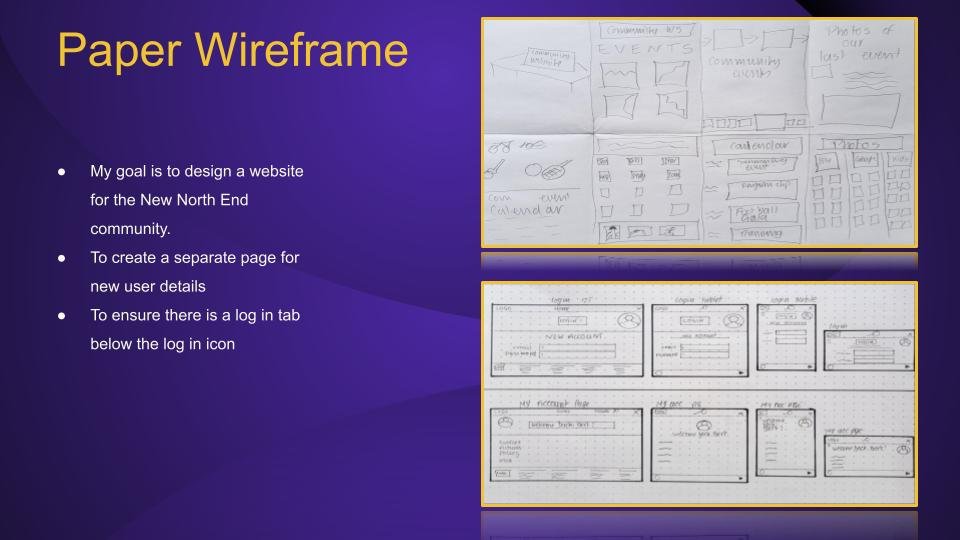
Crazy 8’s and paper wireframe
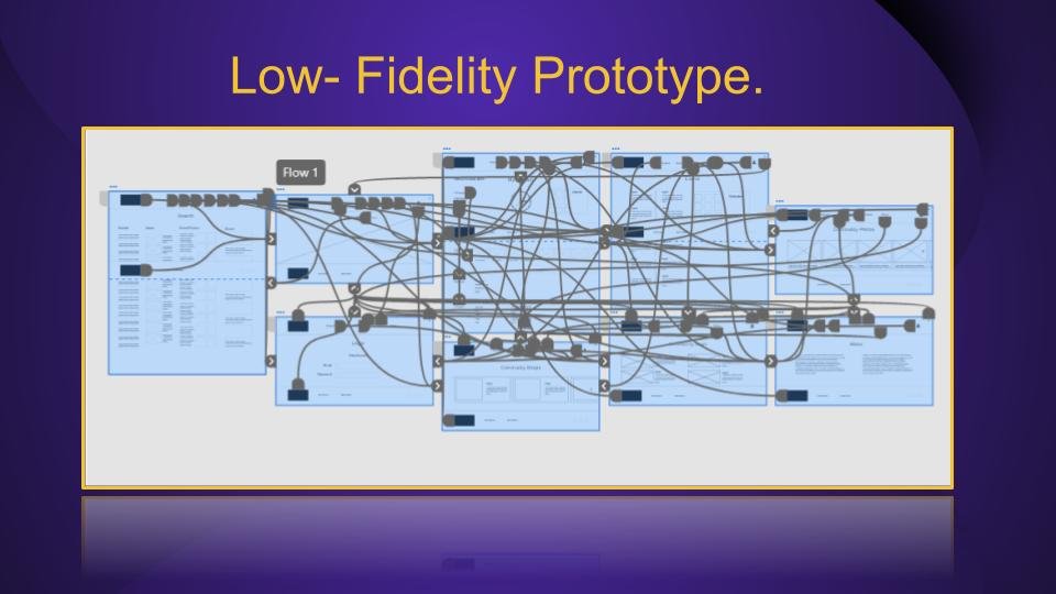
Digital Wireframe.
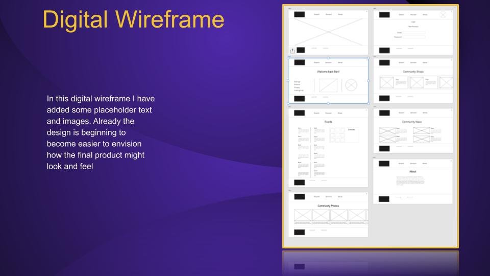
In this digital wireframe I have added some placeholder text and images. Already the design is beginning to become easier to envision how the final product might look and feel
Usability study details
Research Question
Do the participants live locally?
How often do the participants attend local events?
How do participants normally hear about local events?
Would they attend more if they were better informed of events?
Would participants like to save photos of recent events?
The Participants
Four females and one male will carry out the study. one female is transitioned recently and is Asian. Another female has the use of only one arm. two of the participants are African and speak very little English
Each of the participants will reside within the local area and have a keen interest to join in with local events.
Methodology
Remotely and in-person, Unmoderated usability studies
Remote studies will be carried out in participants' homes, and in-person interviews will be carried out in a neutral and safe location in Vermont, USA.
Remote studies will be conducted on March 10th, 2023, at 10;00 AM.
In-person interviews will be conducted on March 14th, 2023, at 9:30 AM.
Each session will last approximately 40 minutes
Each participant will fill out a System Usability Study comprising ten questions after completing tasks.
Each participant will receive $20 gift vouchers to be redeemed at most stores and shops.
Patterns and Insights
Pattern Identification
It was observed that 2 out of 5 participants Requested a log in tab below the icon. This means that Just using an icon is not enough.
It was observed that 2 out of 5 participants said there should be a home tab in the navigation bar. This means that Not everyone recognizes the logo as the home page navigation
It was observed that 2 out of 5 participants Think the new account detail field is too close to the log in tab. This means that The user might think they both function in the same way.
Insights
Based on the theme that: Non-English speaking users find it challenging to navigate to the log in page, an insight is: The log in icon could be made more evident).
Based on the theme that: There was some confusion as to how to log in, an insight is: There should be a log in tab below the icon.
Based on the theme that: because not everyone knows the logo can be clicked on to take users back to the home page, an insight is: a home tag should be added to the navigation bar.
Supporting evidence
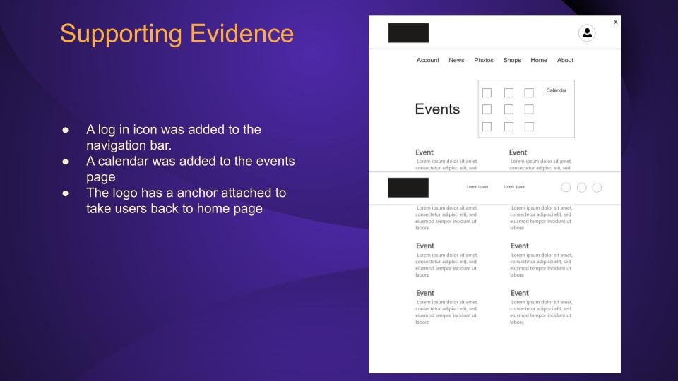
Mock-up
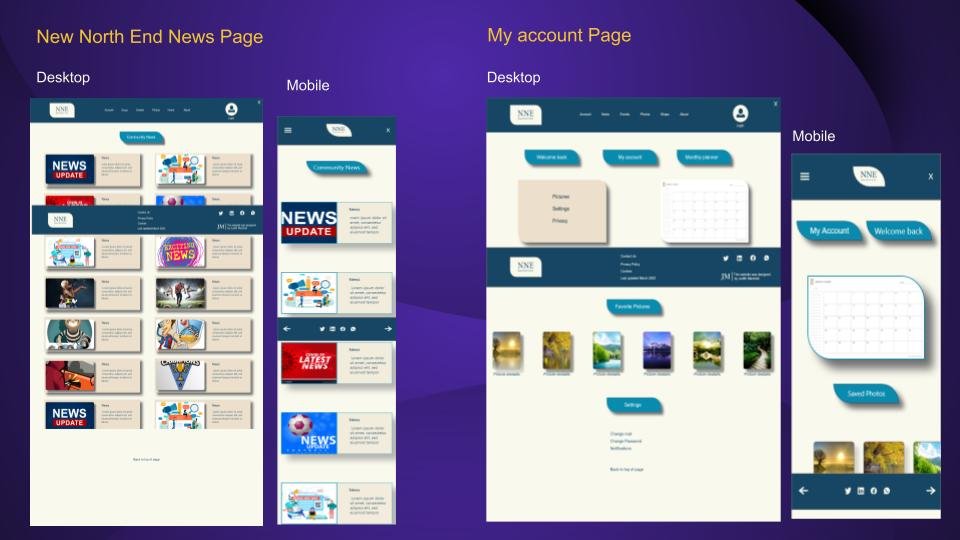
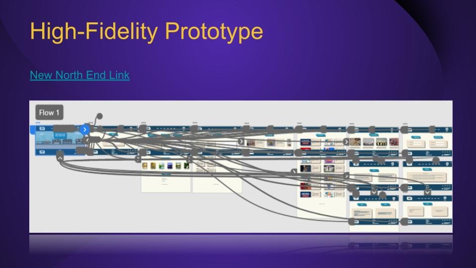
The High-Fidelity screen below demonstrates how a few simple changes in the layout enable users the ability to navigate from the home page to the login page easier
There have been a few subtle changes in appearance:
The page title button has color added to make it stand out clearer.
The logo has been minimized slightly so that it does not seem so intimidating.
Accessibility considerations
On the home page, I added a type under the log-in icon so that screen readers can tell users with less visual abilities where to log in. The log- in icon is universally recognizable but not enough for users with poor vision.
Throughout the design, on all screens, I allowed for high-contrast colors. I also ensured that the font was large and clear to read.
Takeaway and next Steps
Takeaways.
In the real world I believe the users will find this an enjoyable experience. This website, also designed for other platform sizes, has been adapted and customized to fit into everyone’s life, globally.
What I learned:
I have learned much during this design and I have no doubt there is still more to learn, UX design is ever-changing.
I come to realize that no website is ever truly complete, even after it has been launched out into the WWW. There will always be updates as is true with all websites.
This design was heavily influenced by the research and ideation ensuring users’ needs are met every step of the way.
Next Steps
My next steps along the UX design path are to analyze and research how to improve the appearance and functionality of this website so that users will continue to feel safe and navigate with ease throughout. I am open to recreating elements and features to enhance the look and feel of this site
I believe there is always room for improvement because why settle for less?


