

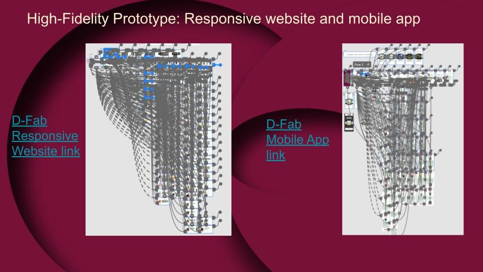
D-Fab Responsive website and mobile app project

Project background
My role:
Conduct user research
Wireframing
Prototype
Conduct user studies
Redefine the project
Project Name: D-Fab. Digital fables
Project duration: 6 weeks, Start date March 2023
Project Overview
Users want to be able to read on their mobile apps and order from their Desktops
Users want to read multiple books and store them on either device
I need to discover new ways to make these new features work for the user experience, ensuring their journey is smooth and complete.
Issues with the current web:
A bookmark is needed
A page where books can be stored
User needs to be able to buy books easily

Understanding the Users

User Journey
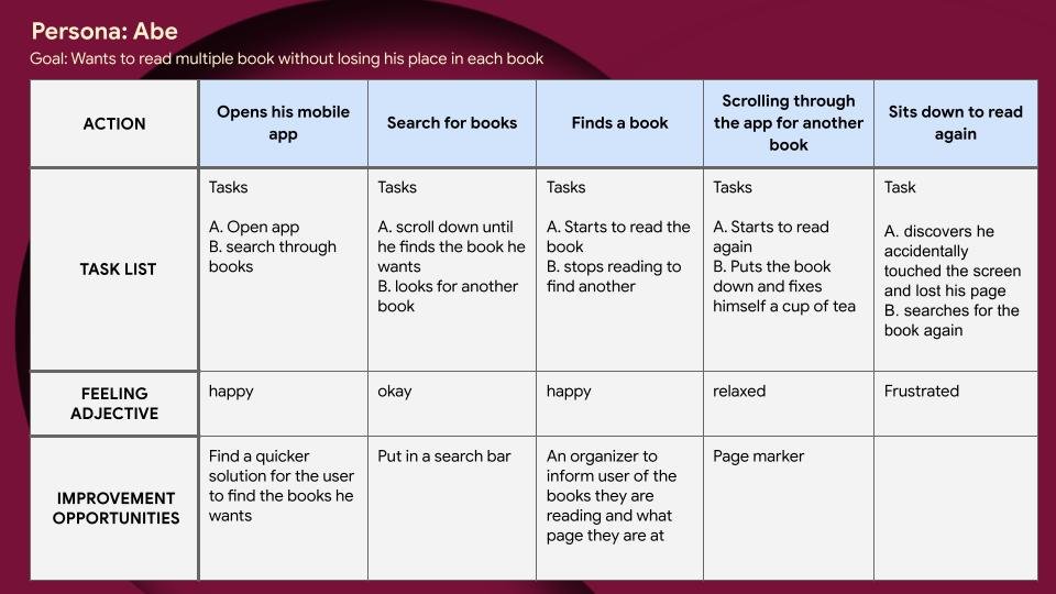
Abe’s User Journey
Pain Points
Users found buying books difficult because there were no clear indications on how to purchase them
One of the users wanted to be able to store their books in one place and keep them in order.
As a retired Professor I want to be able to read as many books on my mobile app as and when I require So that I can continue to read whenever the mood takes me.
Abe’s User Story
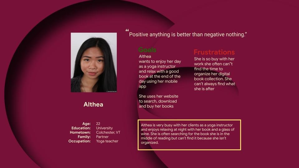
As a Yoga Instructor, I want to be able to go straight to a book I am halfway through reading So that I can enjoy the evening reading instead of searching.
Althea’s User Story

Altheas User Journey
Users said the bookmark needs to be clearly visible and functionable so that they could see where they left off
All users wanted to to a confirmation page because they felt uneasy about buying something and not having their purchases confirmed
The Design Journey Begins

Crazy 8’s

Responsive Website Paper wireframe

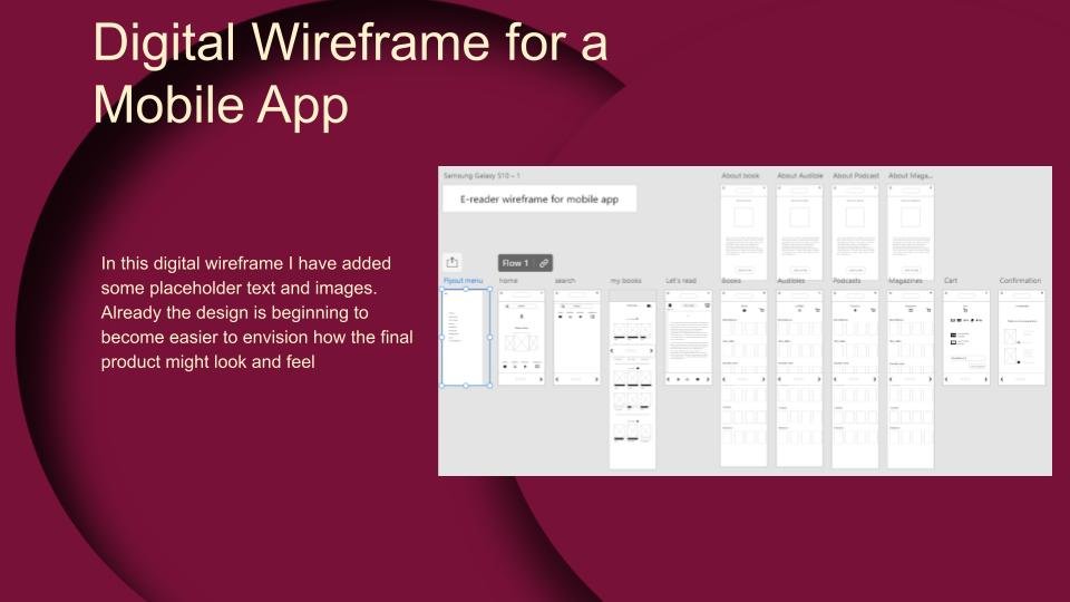
Mobile app wireframe
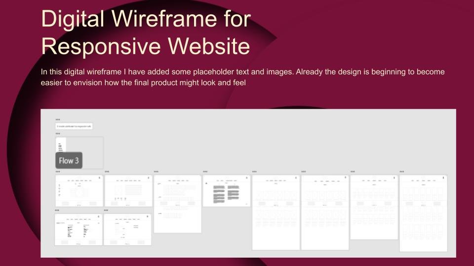
Digital Wireframe

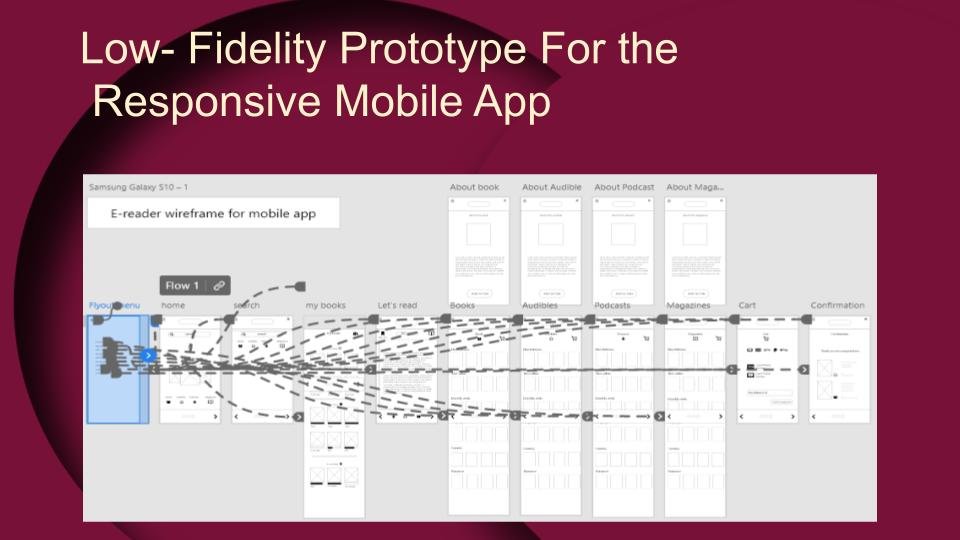
Low-Fidelity Prototype
Usability Case Study
Research Questions:
Were users able to find find the bookmark?
Where are participants able to buy a book?
Were participants able to navigate from page to page with ease?
Can participants save their purchased book, audible, podcast or magazine on their ‘My book’ page?
Were users able to bookmark a page on the‘Let’s Read’ Page?
The Participants:
Two females and three males will carry out the usability study.
Three are American and speak fluent English. One is Chinese and speaks broken English, and one is Russian who also speaks English.
Two of the participants are Neuro divergent and find it difficult to concentrate.
Methodology:
Remotely and in-person, Unmoderated usability studies Remote studies will be carried out in participants' homes, and in-person interviews will be carried out in a neutral and safe location in Vermont, USA. Remote for users in other countries
Remote studies will be conducted on April 21st, 2023, at 6:00 AM.
In-person interviews will be conducted on April 22nd, 2023, at 9:30 AM.
Each session will last approximately 35 minutes
Each participant will fill out a System Usability Study comprising ten questions after completing tasks.
Each participant will receive $20 gift vouchers to be redeemed at most stores and shops.
Patterns and Insights
Pattern Identification:
It was observed that 4 out of 5 participants understood why a bookmark was necessary. This means a bookmark should remain a feature.
It was observed that 3 out of 5 participants suggested a cart icon could be added. There will be clear indications as to how to successfully make a purchase.
It was observed that 4 out of 5 participants Could not save a page. This means that a functioning bookmark should be added.
It was observed that 2 out of 5 participants were unable to buy a book. This means that a better buying feature should be added.
Insights:
Based on the theme that: Participants understood the need for a mark was necessary, an insight is: No action is needed at this time.
Based on the theme that: All Participants suggested a cart icon was needed, an insight is: A cart will be added for easier buying.
Based on the theme that: None of the participants knew how to save a page, an insight is: The Bookmark Icon needs to be repaired for easier use.
Refining
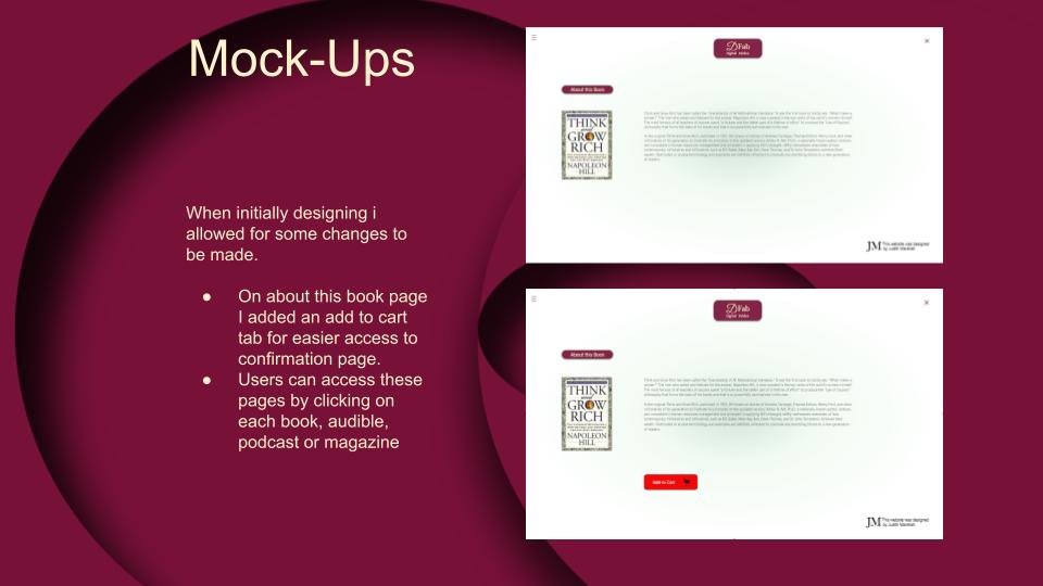
When initially designing I allowed for some changes to be made.
On the, about this book page, I added an, add to cart tab, for easier access to the confirmation page.
Users can access these pages by clicking on each book, audible, podcast or magazine.
Mock-Ups
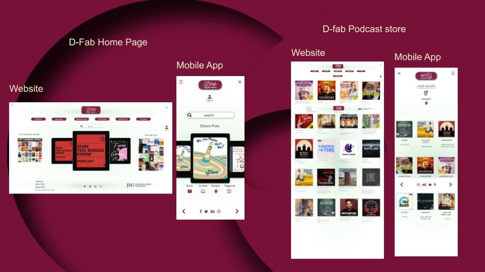
After conducting the usability case study and refining I was able to include more visual changes. Color, typography, Iconography, and imagery was added to make the site look and feel like a better user journey experience.
Accessibility Considerations.
As with all other designs, it has been my mission to ensure that users from all walks of life with diversity set in mind, I allowed for visual disabilities, language barriers, hearing difficulties and other hurdles that users may face, might have an enjoyable user journey.
The text is clear and legible.
I allowed for less clutter so as not to overwhelm the user.
I ensured that there is sufficient contrast for the visually impaired users
Universally recognized icons were used whenever and wherever needed.
In the real world, I believe the users will find this an enjoyable experience. This website, also designed for other platform sizes, has been adapted and customized to fit into everyone’s life, globally.
The development throughout this site has grown from the seeds of ideation and developed into a mighty oak, flexible in the winds of change yet strong at the root.
I have learned much during this design and I have no doubt there is still more to learn, UX design is ever-changing.
I come to realize that no website is ever truly complete, even after it has been launched for all to see There will always be updates as is true with all websites.
This design was heavily influenced by the research and ideation ensuring users’ needs are met every step of the way.
Takeaways
As always, my next step along the UX design path is to learn more in the ever-changing industry of UX Design. I wish to analyze, and research alternative ways in which to improve the appearance and functionality of this website so that users will continue to feel safe and navigate with ease throughout.
I believe there is always room for improvement because why settle for less?