

Ethan Allen Healthy Food restaurant
Mobile app
Project overview

It all started with an idea, an idea that grew into an accessible, user-friendly, functional mobile app.
The project overview explains issues with the app and it is my mission to find a solution.
This app failed to:
Remember user details on the payment page
Supply payment confirmation page
Have a notification feature
Allow Users to store their favourite food.
What are the issues?

Understanding the User.
In order to better understand the user experience I created a persona whose name is Alfie Vase.
Alfie wants an app that meets his needs with his healthy food choices.
He has a very busy schedule and can’t find the time to cook for himself.

User Journey Map
In this user Journey map, I identified:
User actions
User task list
User feelings/adjectives
Users input on how to make improvement and opportunities
The user wants to go to a recently ordered page where they can quickly click on their last ordered or favorite meals instead of having to scan the whole menu.
The user pain points
Users want a confirmation page after making an order, before making a payment
When the user goes to pay, they become frustrated because they have to re-enter their payment details. This can be time-consuming
After the food has been ordered, the user would prefer to be notified when their food is read for pickup instead of having to guess and find a line of people waiting for their food.

Starting The Design
The design journey starts with crazy 8’s, a fast and fun exercise to get the creativity warmed up
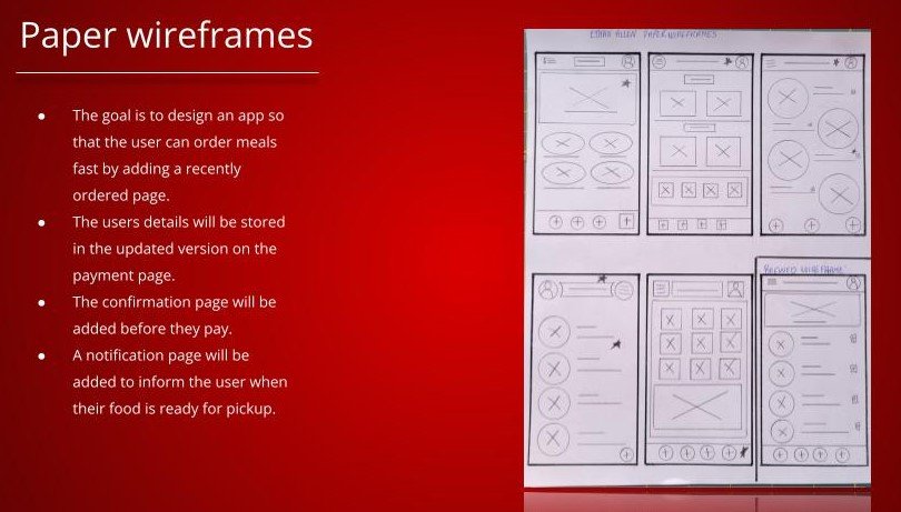
With the creativity lubricated, it’s time to draw five wireframes. I then created another with the best of five features from the first five wireframes
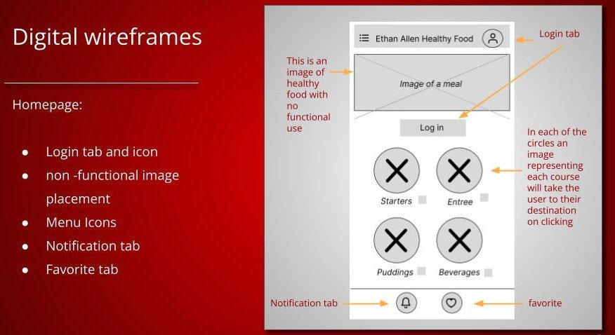
Once I was happy with my choice, I took my paper wireframe and started the digital wireframe process.

Low-Fidelity Prototype
Once all of the digital wireframe pages had been created and positioned in order of the flow, I then started to carry out the Low-fidelity prototype process or, as I call it, I made a plate of spaghetti!
Conducting a Usability Study Research
Research Questions:
What can we learn about the user flow? The steps they take from ordering to payment.
What are the common pain points that users are experiencing on this app?
Is there a better way to make this app a more enjoyable experience?
The Participants:
Two females and two males, and one who identifies as they/them. All come from diverse backgrounds between the ages of 25 and 65.
One male is blind in one eye and uses a screen reader.
The Methodology:
45 minutes for each participant
Taken in and around Vermont, USA
Unmoderated usability study
Each Participant will be asked to conduct a Low-fidelity prototype study. Each participant filled out a System Usability Study comprising ten questions after completing tasks.
Identifying Patterns and Insights
Patterns:
It was observed that 3 out of #5 participants needed help to navigate to the recently ordered page from the home page. This means that there may have been too many choices on offer.
It was observed that 3 out of 5 participants wanted a confirmation page before paying. This means that adding a food-ordered confirmation page might be necessary
It was observed that 4 out of 5 participants want notification when their food is ready to pick up this means that adding a notification page/button should be included.
Insights:
Based on the theme to make a recent order button on the homepage, an insight is: The tabs or buttons need to be added and/or titled clearer.
Based on the theme that an order confirmation page needs adding an insight is: Create a page which directs users to view their order before paying
Based on the theme that participants wanted a notification page, an insight is. Add a notification page.

Supporting Evidence
The Image shows us that after refining the design, a recently ordered, and confirmation page has been added as suggested by the participants who took part in the usability study test.
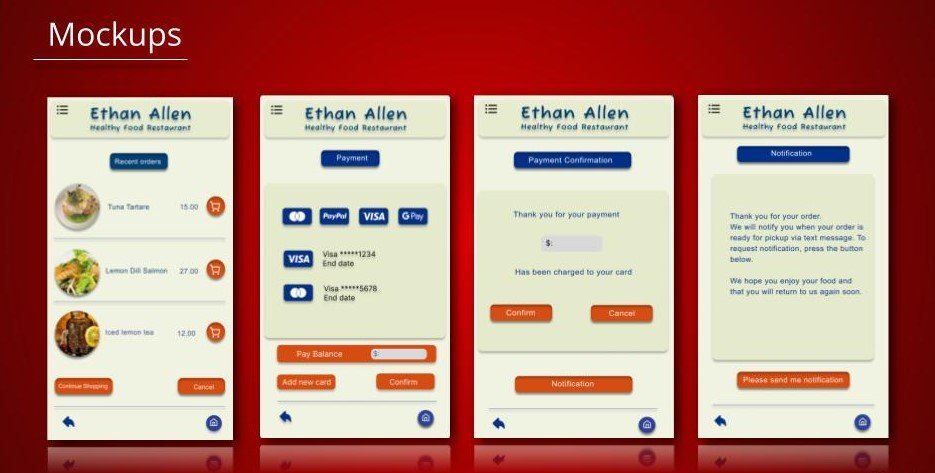
Mock-ups
After redefining the wireframe, it’s time to add imagery, typeface and color. The design is beginning to look and feel a lot more like a real mobile app now.
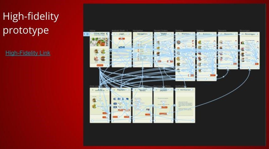
High-Fidelity Prototype
The Mock-up process is complete and that means it’s time for the High-Fidelity prototype stage. As there are more pages, the prototype becomes a lot more congested. This is a necessary exercise in order to connect all elements and pages together.
Accessibility Considerations.
On the home page, I added a type under the log-in icon so that screen readers can tell users with less visual abilities where to log in.
Throughout the design, on all screens, I allowed for high-contrast colors.
Low contrast makes it difficult for many users who are color blind
Universal icons were installed on each screen.
Each icon is recognized globally making this an accessible app.
Takeaways
Impact:
In the real world, I believe that users will find this an enjoyable experience. This app has been customized to fit into everyone's life, globally.
The development throughout the design has grown from the acorn of ideation and developed into a mighty oak, flexible in the wind and strong in its roots.
What I learned:
I learned a lot throughout this design, and I have no doubt there is still much to learn. I also understand that this app may never be truly complete, even after launch there will be updates added to it. This design was heavily influenced by the research and ideation ensuring users’ needs are met every step of the way
How I wish to go forward with this project is to find ways in which to improve the design. Why? Because there is always room for improvement.
Another step I would take with this app is to discover if the users’ needs have been met by carrying out another usability study. Even though I have completed designing at this stage, I am fully aware that the design will evolve.